

Pop art has been around long enough that some people assume it has already done everything it can do. Bright colors. Comic-style dots. Celebrity faces. Product packaging. Big attitude. End of story. Not quite.
The truth is, pop art keeps changing because artists keep dragging it into new spaces. Digital tools changed it. Street culture changed it. Social media definitely changed it. Even the way people look at color and everyday objects feels different now. So when an artist starts exploring modern pop art techniques, they are not just copying a famous old movement. They are stepping into a style that still has a lot of room to play.
And that is the fun part. Pop art is bold, sure, but it is also flexible. It lets artists be loud, funny, sharp, ironic, messy, polished, or all of the above. It can look clean and graphic or rough around the edges in a way that actually helps the piece. Sometimes the little imperfections make it better.
That freedom is a big reason artists keep returning to it.
One thing pop art usually gets right is clarity. The image tends to hit fast. A viewer does not need to stare for five minutes just to understand what they are looking at. The shape is clear. The contrast is strong. The focus is obvious.
That does not mean the work has to be simple-minded. It just means the design needs direction. This is where modern pop art techniques often begin. A single face. A repeated object. A dramatic hand gesture. A cropped eye. A familiar snack bag. Something easy to recognize, then pushed into something louder and more stylized.
A lot of beginners make the mistake of adding too much too soon. Too many symbols. Too many colors. Too much background noise. But pop art usually works better when the main image has room to breathe. Bold shapes need space. Contrast needs room. The artist does not have to fill every inch just because the canvas is there.
Sometimes the stronger move is cutting back.
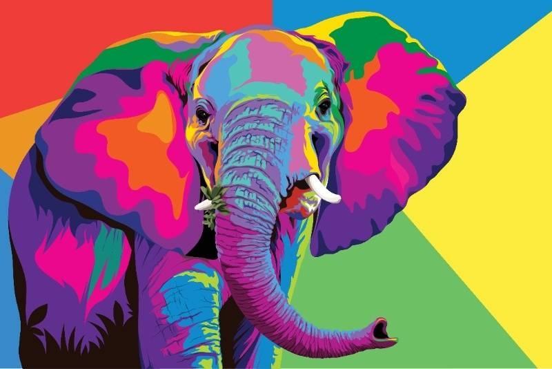
If someone strips pop art down to its bones, color is doing a shocking amount of the work. Loud pink against acid yellow. Electric blue next to red. Flat skin tones paired with unnatural shadows. That kind of color tension is one of the fastest ways to give a piece pop energy.
This is why pop art color techniques matter so much. The goal is not simply using bright color. It is using color with intent. A limited palette can work beautifully if the contrast is high and the choices feel deliberate. Neon can work. Primary colors can work. Even black and white with one sudden accent color can work if the composition is strong enough.
The artist also needs to think about emotional effects. Does the piece feel playful, aggressive, nostalgic, commercial, or weirdly glamorous? Color can steer all of that without saying a word.
And honestly, this is where people get stuck. They want bold color, but they do not want the piece to look childish. Fair concern. The fix is usually not muting everything. The fix is making the palette more controlled.
Pop art has always had a thing for ordinary stuff. Food packaging. Household items. Advertising imagery. Cheap objects people see every day and barely notice. That is still one of the easiest and smartest ways into the style.
A plain object becomes interesting when the artist changes its scale, repeats it, crops it hard, or places it in an unexpected color world. A soda can becomes graphic. A lipstick tube becomes theatrical. A pair of sunglasses becomes almost iconic. Suddenly the familiar thing does not feel so ordinary anymore.
This is where a lot of pop art creative ideas begin. The artist looks around instead of trying to invent something wildly original from nothing. There is no shame in that. Pop art has always been good at remixing the visual language people already live with.
And that everyday focus keeps the work approachable. A viewer may not know the theory behind the piece, but they know the object. That immediate recognition creates a connection fast.
Pop art did not stay trapped in print shops and paint studios. It moved straight into screens, and honestly, it adapted pretty well. Layers, duplication, filters, clean vector lines, collage effects, and fast color testing all make digital work a natural fit for the style.
That is why pop art digital art keep growing. Artists can build repeated portraits, test color combinations quickly, add halftone textures, distort photos, and create polished graphic pieces without losing the playful spirit that makes pop art work. Digital tools also make it easier to experiment without feeling like every mistake is permanent.
That said, digital pop art still needs taste. Software can do a lot, but it cannot decide what makes the image compelling. The artist still needs to guide the piece. Which element repeats? What gets exaggerated? What needs flattening? What should stay raw?
A lot of the best digital pop work feels edited, not overloaded. That is the difference.
Check Out: Discover Pop Art Mural Trends in Public Spaces in 2025
One of the most recognizable pop art moves is repetition. Same face. Same object. Same silhouette. Again and again. But the trick is that repetition is not just decorative. It changes the meaning of the image.
A repeated image can feel commercial, mechanical, ironic, obsessive, funny, or strangely emotional depending on how it is handled. Even small changes between repeated images can create tension. Different colors. Slightly shifted alignment. One altered expression. One object flipped the wrong way. Tiny change, big effect.
This is where pop art painting methods can become more experimental. A painter might repeat the image by hand with visible variation, while a digital artist may create a more exact sequence and then break it on purpose. Both approaches can work.
And there is something satisfying about repetition. It feels rhythmic. Graphic. A little bold, a little bossy. In a good way.
Pop art often looks flat by design, but that does not mean it needs to feel lifeless. Texture can rescue a piece from looking too clean or too generic.
This can come from visible brushwork, rough printed edges, halftone dots, paper collage, layered scans, spray paint touches, or distressed digital overlays. Texture adds friction. It gives the eye something to catch on.
That is one reason pop art illustration tips often include mixing clean graphic forms with something more tactile. A perfectly flat area of color next to a rough edge can make the whole piece more interesting. Same with a crisp face over a grainy background. The tension helps.
Too much texture can muddy the image, sure. But none at all can make the work feel sterile. Pop art often lives best in that middle zone where the piece still feels made by a person, not just manufactured.
Pop art does not always need a deep, heavy message to matter. Sometimes it works because it is funny. Or sarcastic. Or slightly ridiculous. Exaggeration is part of the language.
That might mean enlarging one feature until it becomes absurd. It might mean pairing a glamorous visual style with a very ordinary object. It might mean turning a throwaway phrase into a dramatic visual centerpiece. These are simple shifts, but they can change the whole energy of a piece.
This is where more pop art creative ideas and pop art illustration tips start opening up. The artist can borrow from ads, comics, product design, internet culture, fashion, memes, or packaging and then twist those references into something personal. Later on, they may return to pop art color techniques, explore more pop art digital art, or refine their favorite pop art painting methods. They may even circle back to broader modern pop art techniques with a better sense of what fits their style.
That is the point, really. Not to make one perfect piece of pop artwork. To keep testing what clicks.
Read More: Pop Art Movement Meaning in Modern Contemporary Art
Half-hearted pop art usually falls flat. The style rewards commitment. Bold crop. Commit to it. Weird color pairing. Commit to it. Repeated object, oversized text, exaggerated contrast, playful visual joke. Commit.
The artist does not need to make the work louder just for the sake of noise. But they do need confidence in the visual decision. Pop art tends to look strongest when it feels intentional, not timid.
And that is probably why so many artists enjoy it. It invites clarity. It rewards risk. It lets them take something familiar and turn it into something louder, sharper, and harder to ignore.
Not a bad deal for one art style.
Everyday objects, self-portraits, packaging, food items, and bold facial close-ups all make strong starting points because they are familiar and easy to stylize.
No. Digital tools help, but artists can also use paint, markers, collage, printmaking, and mixed media to explore modern pop art successfully.
They can use personal subjects, unusual color choices, humor, repetition, texture, and modern cultural references instead of copying older pop art icons too closely.
This content was created by AI